Four Color Process Printing
While other printing processes like letterpress or screen printing are great options for producing your work, this article will discuss offset lithography printing specifically, which is the more standard means of producing most any printed work in mass quantities.
Offset lithography is a process that uses a combination of four process colors, cyan, magenta, yellow, and black, generally noted as CMYK, to produce full-color images. Spot colors, standardized by the Pantone Matching System®, are also available in offset printing, but know that when creating your documents, you need to be sure of two basic image guidelines.
Get the Mode Right
First, always make sure that each and every photo or image you include (both raster and vector) are in CMYK format and not RGB. While RBG offers a greater color range and works well in designing for implementation online, it doesn’t cut it when going to press. Any images that you leave in RGB mode will have to be translated into CMYK by your prepress operator before going to print. This not only takes more time for a prepress technician, but leaves you unsure as to how your color will turn out once on press.
Getting the fonts right
Don’t Bold or Italicize Fonts From the Style Menu
In any standard layout program, there’s a font bar where all of the options for choosing a font and it’s characteristics can be found. Included in this bar is usually a drop down menu for selecting your font name, along with other attributes, such as leading and kerning, font weight, and paragraph alignment. Some of these programs, like Quark, include drop down menus that allow you to apply characteristics like “bold” or “italic” even when the font you’ve chosen doesn’t include those particular styles.
For instance, if you have the Tahoma font family installed on your system, which happens to include only Tahoma Regular and Tahoma Bold, this extra drop down menu might allow to you to turn it into an italicized font. Even though this is tempting, don’t ever do this when creating a document to send to print. When your printer receives the file and sends it to press, the font will be replaced by a font that is in its system and remove the italic attribute (or any other that you’ve applied arbitrarily). Therefore, always remember to choose a specific font that already has the attributes you’re looking to apply included in the actual font family.
Prep Them...all of them
When you’ve finished creating your design, you’ll want to do a couple things with your fonts in order to send them you your printer correctly.
Packaging
Typically, printers ask that you package a copy of all of the original font files contained in the documents you’re printing along with all of your other files, so that in the event something goes wrong with one or more of your fonts. This way, when they open your documents, they’re able to install the fonts on their own system in hopes of correcting the problem.
Outlining
In addition, they’ll ask that you do what’s referred to as “outlining” your fonts. In essence, this turns the characters of each font into paths rather than actual type, almost like you had drawn a shape in Illustrator, rather than typed text with the Type tool. This way, when a file is opened, the software program isn’t trying to call up a font, because it’s only recognizing a shape, and the issue of missing fonts or replacing is completely avoided.
As a note, this cannot be done in Photoshop. There are more detailed reasons why (mostly to do with the difference between rasters and vectors), but know that you should always flatten Photoshop files so your printer can see what the final image should like like, and send over a layered file along with any fonts you used in creating it, as well. This way, if a printer needs to work with your layered file for any reason, they’re able to do so, and they have the ability to temporarily install your fonts while working with your file without the fear of one being automatically replaced in the process.
However, it is recommended that, even if you’re laying text into a Photoshop file for printing, that you first create it in Illustrator and then drop it into Photoshop after doing so. It might take more time and can be a bit cumbersome having to go back and forth between programs, but the quality of the type will be phenomenally better than that of typing any text in Photoshop.
Image Quality
It shouldn’t have to be said, but 72 dpi (dots per inch) will not produce a quality image on press like it will online. Surprisingly, this is a consistent issue prepress operators face in handling images. Always be sure that each of your images is set to at least 300 dpi before sending them to your printer, or you’ll be sadly disappointed when a gorgeous photo you spent hours editing turns out blurry and pixelated once it’s in your hands.
One of These Blacks is Not Like the Other
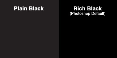
Interestingly enough, there are actually several different types of black when it comes to printing, but the two most widely used terms are “plain black” and “rich” or “full black.” Keep in mind, “rich black” has several variants, depending on your printer’s preference. If you’ve ever created an image in Illustrator that contained sections of black, and later placed it into a Photoshop document where the image sat on top of a black you chose from the color palette in Photoshop, it’s likely you’ve seen this disconnect.
Plain Black
When you use black in a program like Illustrator or InDesign without choosing a Pantone color, the CMYK breakdown automatically defaults to C=0 M=0 Y=0 K=100, where black is fully saturated and the other three are completely absent.
Rich and Full Black
As stated before, there are several variants of rich black, but what’s important to know when you’re designing is that the Photoshop default for black is different than other programs (where C: 75, M: 68, Y: 67, K: 90). It’s likely that Photoshop will be the place you find this difference most often if you’re not intentionally trying to give a piece of your design a darker, richer tone than you get with plain black.
If you are intentionally doing so, make sure to ask your printer which variant of rich black they like to use on press, usually referred to as “warm black” or “cool black,” where there are higher levels of either magenta or cyan, respectively. It’s generally not recommended that you use a completely saturated level of all four colors (where C: 100, M: 100, Y: 100, K:100), as this can over-saturate the paper on press and will certainly give the press operator trouble.
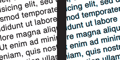
Why it Matters
Other than over-saturating your paper on press or creating a document that has visibly different tones of black than you were expecting, the main headache caused by choosing the wrong black happens in terms of setting type.
As previously mentioned, both Illustrator and InDesign default to plain black, where it’s more often recommended you do your type setting for documents anyway. If, however, something happens where you’ve accidentally set especially large amounts of type in any variant of rich black, you might notice a problem in your final printed piece. If your press operator runs your job and doesn’t perfectly match up each separation of CMYK by precisely lining up the document’s registration marks, or if the paper shifts at all while moving through the rollers on press, you’ll likely see ghosting of one or all of C, M, or Y falling outside of the characters in your type, making it not nearly as sharp as expected. Your printer might end up doing it well regardless, but it also might take them more time, paper, and energy to print it correctly.